 This illustration was difficult to start, but once I put it together, things went well. I like the composition and the color of the piece. I am especially happy with the smoke, because I wasn't sure how it was going to turn out, and I am glad that it looks believable (particularly the smoke from the airship).
This piece is my favorite piece of line art this semester. Pen drawings have always been something that I enjoy doing and am generally successful with, and I think that this was important to have as a strength, since I initially failed so miserably at watercolor and gouache (and still am so so so bad at airbrush). I love this illustration because it actually resembles my shoes and is a good use of hatching as value to create realism. There isn't much indication of texture, but because the shoes are either rubber or cloth, there wasn't much to distinguish between, so I think it works well enough.


This was our first project, and my first attempt at color wash. I think it's very effective, because it gives greater detail to the high contrast line art. I think that it is a good combination of the loose wash and the tightly controlled line art, allowing the two styles to enhance each other and create a richer illustration.

This is a watercolor exercise in which we were supposed to paint 10 watercolors of the same image, cropping and changing color and composition. This was my most successful one of that series, and I think this was the first time I allowed watercolors to bleed and blend together loosely, and I think this has great expressive line that still renders a believable image. I think the composition is strong and the use of empty space and background color was effective. I am extremely happy with this illustration.

My third attempt at the three-image gouache montage was finally something that I was overall happy with. My first two attempts consisted of several good elements, and in the second one, two of the three object and the background looked really good. However, this is definitely my best illustration of the three and I am especially happy with how the penguin turned out. I found that the lego was the most difficult to render because the nature of the technique. I couldn't get a smooth surface because of the gesso texture on the board, and if I overworked it, the color started pulling from the surface. But after a lot of time spent messing with the lego, I think it reads as a lego brick. My only problem is that I accidentally positioned the lego corner behind the penguin's head, which is a stupid compositional mistake. But otherwise I am incredibly pleased with how it turned out.

The memory portrait was quite successful and fun. I was surprised at how well I was able to convey my brother's features. I went with a stylized, slightly worm's-eye view to accentuate his height and simplified the line work so the emphasis was on form rather than detail. I also chose to leave the background blank and use a minimal grounding shadow to again draw attention to the form alone. I was very happy with how this turned out.
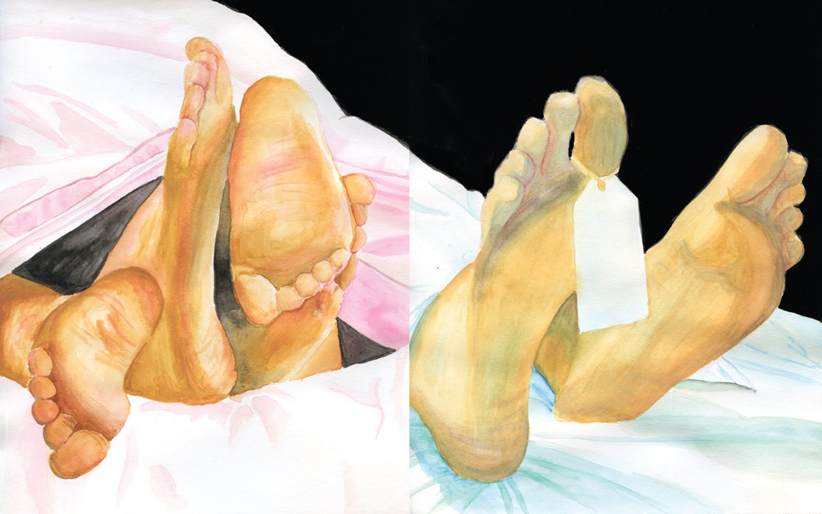
The life and death diptych was one of my favorite projects. I got the inspiration for this piece because in another class, someone was talking about making an absurdist play where the curtain rose just enough to only show the actors' feet. So when coming up with ideas for this project, I developed this idea the furthest, and thought it was a unique way to illustrate the concept. I used warm colors for the life panel, and cool colors for the death panel, and using Rusty's suggestion, I made the sheets in both panels line up so there is more continuity between them. I was frustrated at first because I arranged the compositions to be horizontal and it used the space better in my opinion. But the specs called for vertical images, so I had to change them to fix the assignment. I think that this was an incredibly successful image and conveys the idea of life and death strongly. I also think that it ended up looking fairly realistic and interesting. I was worried about the life panel, because in all my preliminary sketches, the feet blended together and didn't look very good or physically possible. But I think I managed to make it come together and this turned out to be one of my favorite illustrations of the semester.
No comments:
Post a Comment